
Musical instrument website
(UX/UI design / logo design / branding / content writing)
1. Client
ionpercussion.com
2. Project timeframe
March 2025 – October 2025
3. My role
UX/UI designer, graphic designer
4. UI mentor
Mustafa Al Awad
Project description
This project was not a typical UX project as the client did not wish to do any research apart from some basic competitive benchmarking.
The bulk of the project involved redesigning the logo, developing new brand colours, and then using these as inspiration to completely overhaul the exisiting website.
The UI work on this project was extensive as the client wanted a very detailed, high-fidelity prototype with most elements and modules working in full, including the development of product pages which featured audio and video files, and a functioning shop page.
STEP 1: Redesigning the logo
The old logo

The old logo had a couple of very obvious flaws which I wanted to correct ahead of everything else. The accent over the “i” added too much height to the logo, meaning that the logo itself looked quite small when displayed in the nav bar. It thus lacked impact.
On top of this, the very fine lines within the “o” also did not display well in the nav bar. In fact, the detail in the “o” could only be seen clearly when the logo was displayed in a very large format. Even when printed on the products, it looked unclear. This reflected poorly on the brand.
The first draft

In the first draft, I endeavoured to represent the actual product (i.e. a cajon: a wooden box which is played like a drum) using a geometric shape which also incorporated the name of the brand.
As this shape contained both the name of the brand and a pictorial representation of the product, I felt that I could be used independently of any text and would look good when printed on the products.
However, the client did not want any sharp corners on the logo, and so asked me to develop a more rounded, curvy logo.
The new logo
In my final design, I decided to remove the “+” altogether, as this was confusing customers and they were unsure of how to pronounce the name of the brand.
In the main part of the logo, the text has been cut through by an arc, which represents the circular shape of the drum heads (the USP of the company) sold by ion percussion.
The arc simultaneously suggests a smile (to represent the joy of playing music), and also adds motion to the logo, subtly hinting at an upward trajectory.
STEP 2: New brand colours


The old brand colours were a very tired and uninspiring black and white – colours which did not represent anything about the product, while also ensuirng that it did not stand out from competitors due to the lack of originality.
Rebranding of the colour scheme involved choosing both a new brand colour and a new secondary colour, and then using these to extrapolate 14 shades of each to allow for consistent hover effects, gradients etc.
When choosing the new primary brand colour, I decided to choose from a green pallette for a couple of reasons.
Firstly, the product itself is made of solid wood, and therefore green is the perfect choice to reflect the natural origins of the product, as well as the fact that most shades of green contrast beautifully with the wooden tones of the instruments themselves, much as a leaf contrasts perfectly with the bark of a tree.
In terms of the secondary colour, orange is generally seen as playful, which is something that marries very well with a musical instrument brand, for obvious reasons. I opted for a more muted orange to provide a slightly more subtle effect, and to prevent the secondary colour from challenging the primary colour for dominance.
STEP 3: Competitive benchmarking
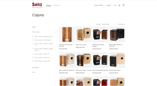
Sela
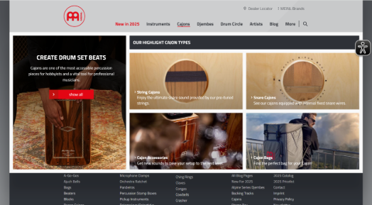
Meinl
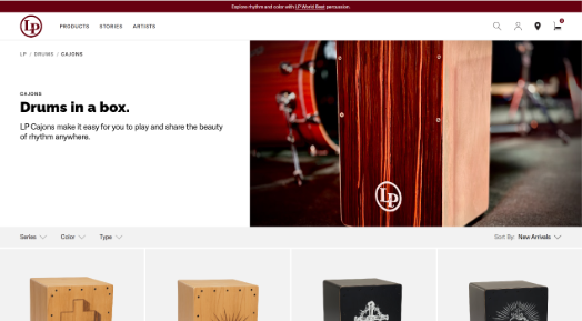
Latin Percussion
In this step, I analysed three competitors’ websites to get a feel for the layout and flow of the sites, including the entire booking process.
I found the style of the Latin Percussion website, with its large “hero” image to be most representative of what I wanted to achieve, and so used this as inspiration for the landing page on the ion percussion website.
Although I advised the client to conduct far more in-depth research before the design phase, he did not wish to do so, so we commenced with the design immediately after the competitive benchmarking.
STEP 4: Content writing
Before the design phase, it was necessary to write all of the text content of the website. This included individual descriptions for every page and every product on the site, which in itself was a large undertaking.
My background in translation and copywriting came to great use here and I was able to draw on my experience of having written content for numerous large German companies in the past.
An example of this content writing can be seen in the screenshot on the right.

STEP 5: Desktop prototype
Homepage (before)
This version of the homepage has been in use for the past number of years, albeit the new logo has now been added, along with a new photo featuring the rebranded products.
However, the page itself provides very little actual information about the products and relies on a number of flashy photos which look very moody and atmospheric, but fail to get the product’s USP and other features across. Despite the relatively extensive length of the homepage, the user is largely in the dark about what the product is and/or what it can do.
In addition, the colours are very uninspiring and fail to elicit any real emotion. The result is a bland, uninformative and uninspiring experience for the user.
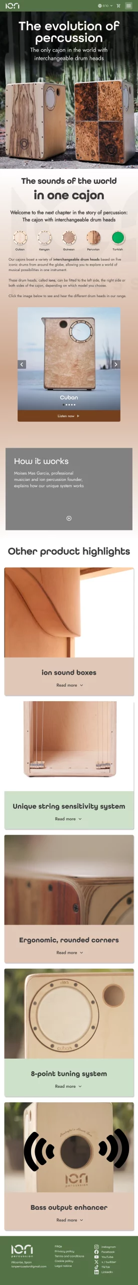
Homepage (after)
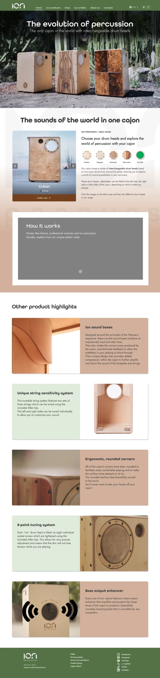
The redesigned homepage features a new header and footer in the updated brand colours, offset against the new secondary colour which is used in both the background and on product cards. This immediately makes the user more engaged with both the brand and the product.
The product’s USP is explained clearly, and the first section features a slider gallery with integrated audio clips to allow the user to see and hear the various items in the product range.
Following this, there is a video of the product in action, as well as a card gallery with large photos and in-depth descriptions of the product’s main features.
Shop (before)
")
The layout of the shop page looked quite unprofessional, with no visual hierarchy and no clear boundaries betweeen the various products.
Shop (after)
")
The redesigned shop page has been configured so as to apply visual hierarchy to the products in order of popularity. Not only does this make the page look more orderly, thus simplifying the purchasing process for the customer, it also adds to the professionalism of the brand, which creates trust among users of the website.
Product configurator (before)
")
The product configurator, which is a key part of the purchasing process for the most expensive products in the shop, is badly laid out, with poor visual hierarchy, visually jarring alignment of elements, and masses of text displayed in one big block at the end – something which is often very off-putting for users.
Product configurator (after)
")
The updated configurator is far more user-friendly than the previous version, with much clearer visual hierarchy, more legible product information and a more colourful and engaging selector element.
As well as this, the page is far less cluttered due to my decision to employ progressive disclosure, rather than displaying all available information on the page at the same time. So, for example, all in-depth information remains hidden until the user clicks on either “for sound clips and videos, click here” (which opens a pop-up modal box) or “I want to personalise my cajon” (which reveals a new section).
Contact page (before)
")
The original contact page provided almost none of the information that customers expect to see on a contact page, such as the opening hours, telephone number and location of the company.
This resulted in large numbers of emails being received by the company, with simple questions which could, and should, have been answered on the contact page. This added workload (and the associated stress) could have been avoided with ease by improving the user interface.
Contact page (after)
")
The reconfigured contact page addresses the glaring omissions from the original page.
An information box provides all relevant information on contact mehtods and opening hours, while an embedded map provides precise information about the location of the company, which is extremely useful for both customers and suppliers alike.
In addition to this, the more extensive information on workshops and corporate evens should lead to increased revenue streams from these areas.
STEP 6: Tablet & mobile prototypes
Tablet prototype
Mobile prototype
