
Hotel booking website
(UX/UI design)
1. Client
The UX Design Institute
2. Project timeframe
February 2024 – October 2024
3. My role
UX/UI designer
4. UI mentor
Mustafa Al Awad
Project description
The process of booking a hotel often sets the tone for a traveller’s overall experience, yet many existing platforms fail to provide a seamless, user-centered journey. A frustrating or overly complex booking experience can not only deter potential customers but also negatively affect how they perceive a brand.
For this project, I designed a responsive hotel booking website aimed at simplifying essential tasks—searching for hotels, comparing options, and completing bookings—while addressing common user pain points. Grounded in UX as a problem-solving discipline, I began with comprehensive research to uncover user expectations and frustrations. Using methods like competitive benchmarking, user surveys, and usability testing, I translated insights into a user-friendly prototype that removes friction and elevates the booking experience.
STEP 1: The research phase
- Competitive benchmarking
Title
Title
Title
Title
Title
Title
Title
Title
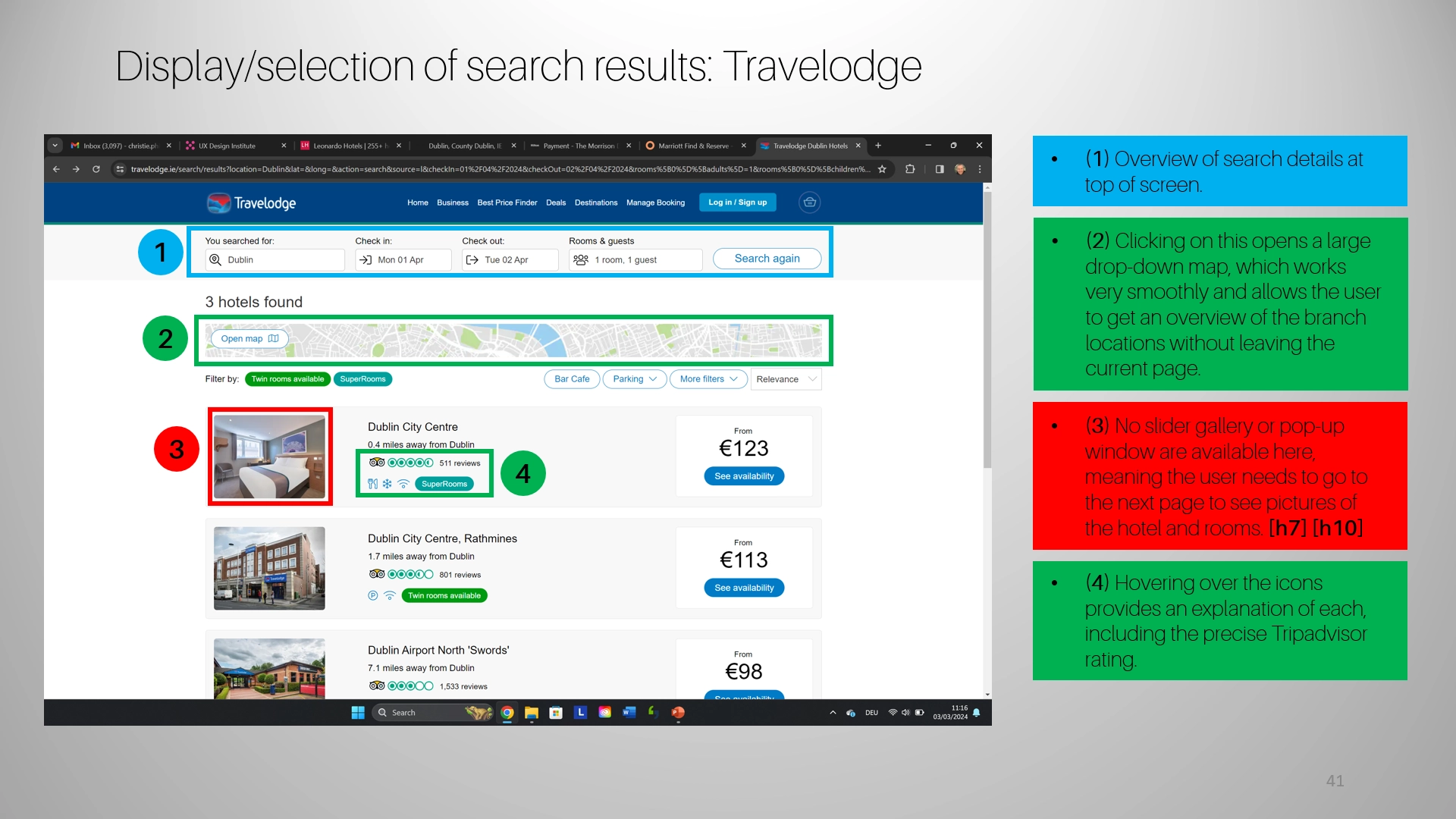
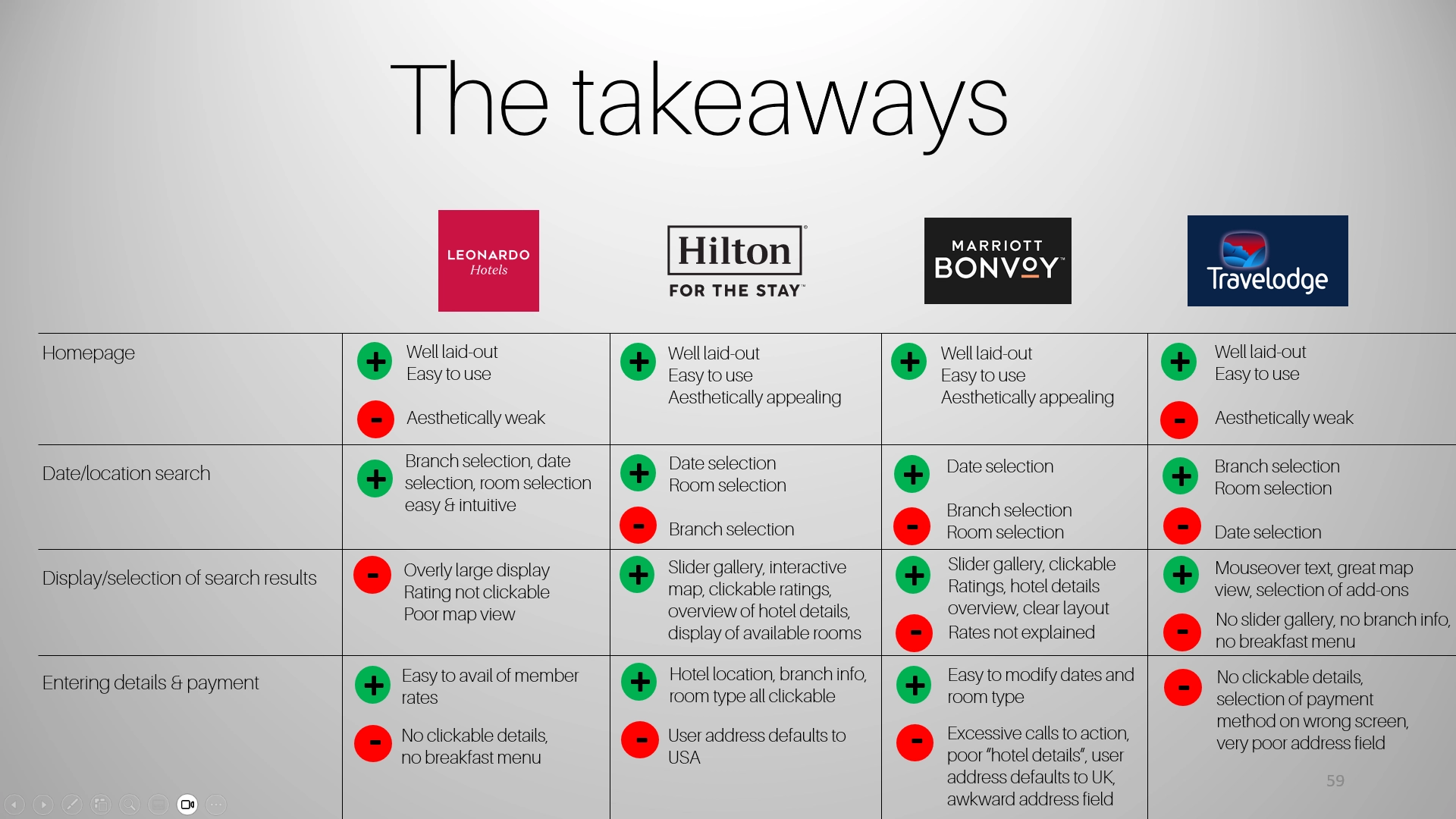
Analyzing competitors is essential for identifying industry conventions, innovations, and opportunities for improvement.
For this project, I reviewed four hotel booking websites: Hilton Hotels, Marriott-Bonvoy, Leonardo Hotels and Travelodge.
The analysis focused on key aspects like homepage design, search and selection flows, booking details, and overall performance. This comparison revealed strengths to emulate, gaps to address, and best practices to integrate into my design solution.
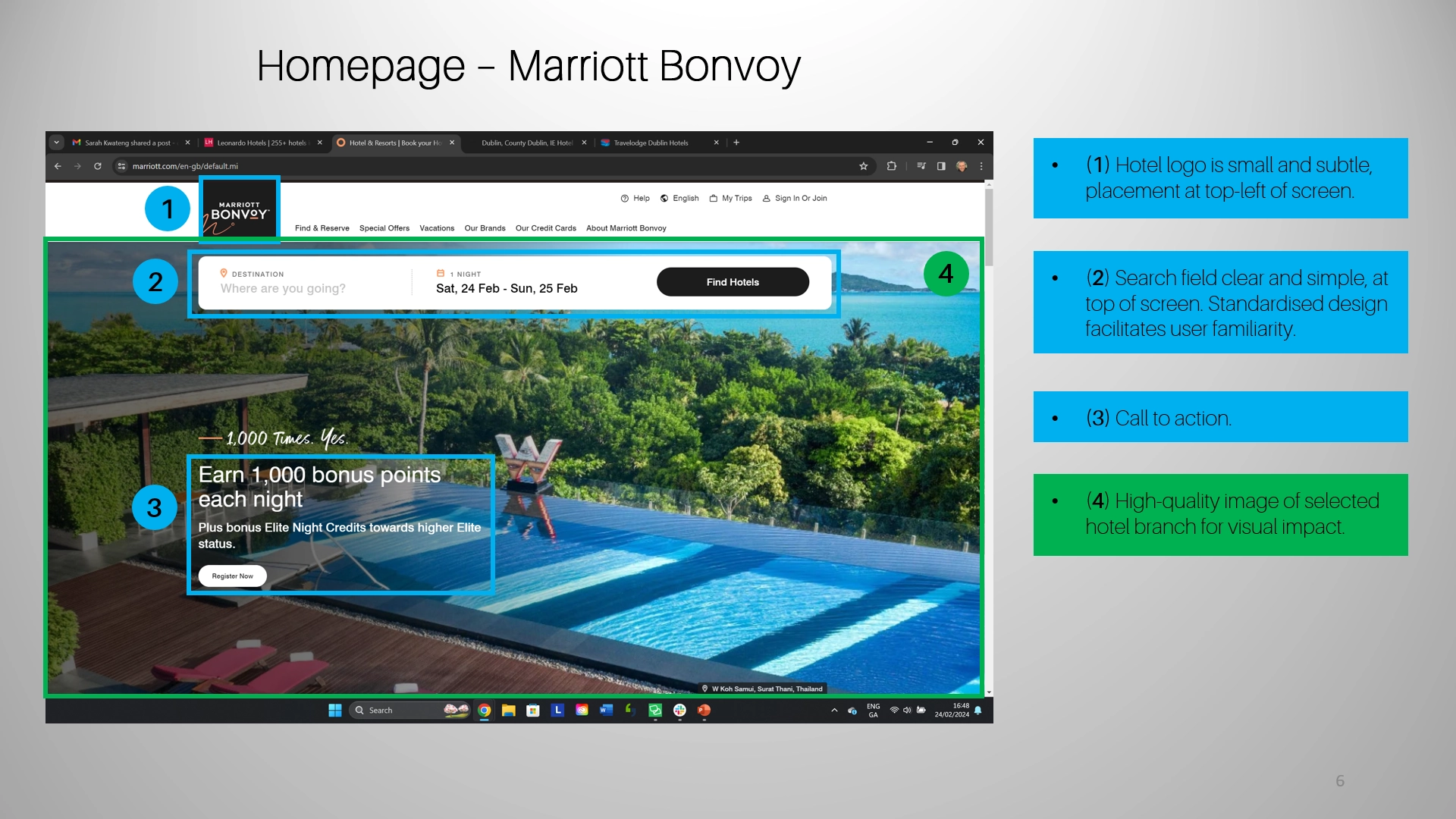
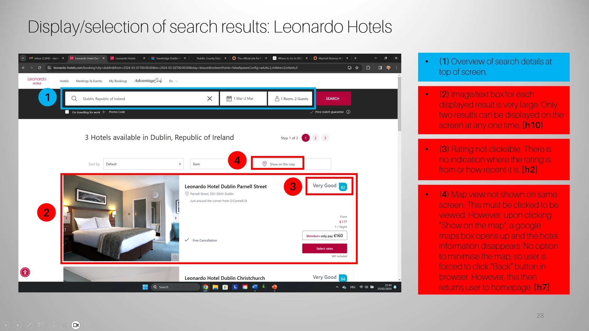
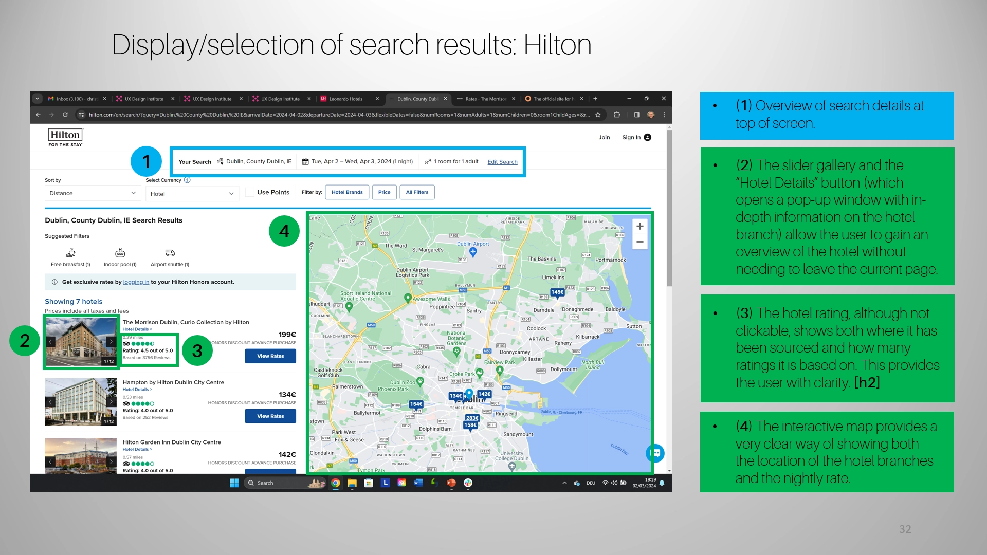
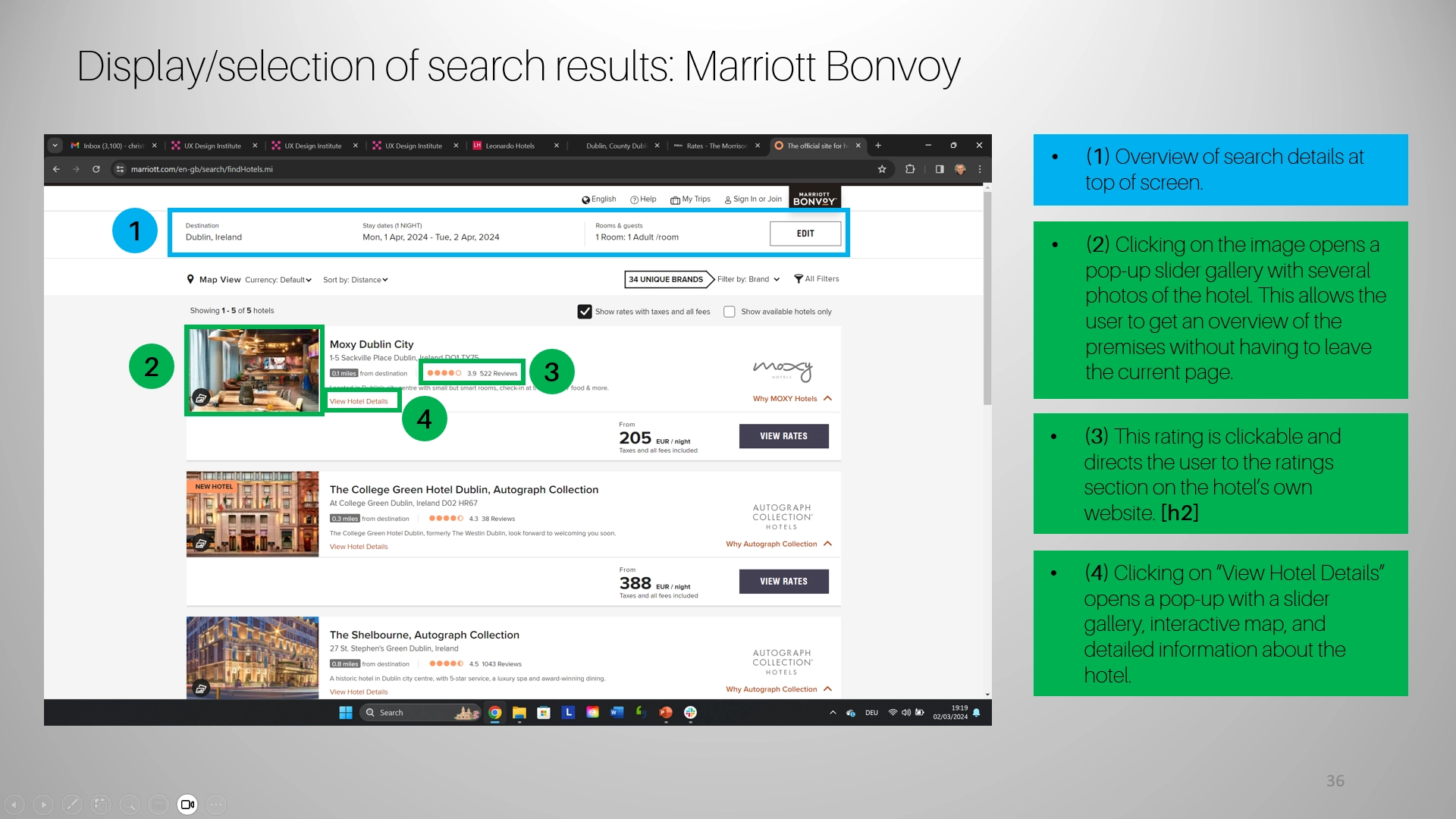
Efficient date selection
The date selector must align with user expectations but many lack a confirmation button and proper closing behavior, leading to potential errors. Adding these features would improve the efficiency of the process.
Room information & photos
Users of hotel booking sites often want or need as much information as possible in order to make informed decisions. This information needs to be ordered and easy to read.
Users also appreciate as many images of the hotel (and especially the room) as possible.
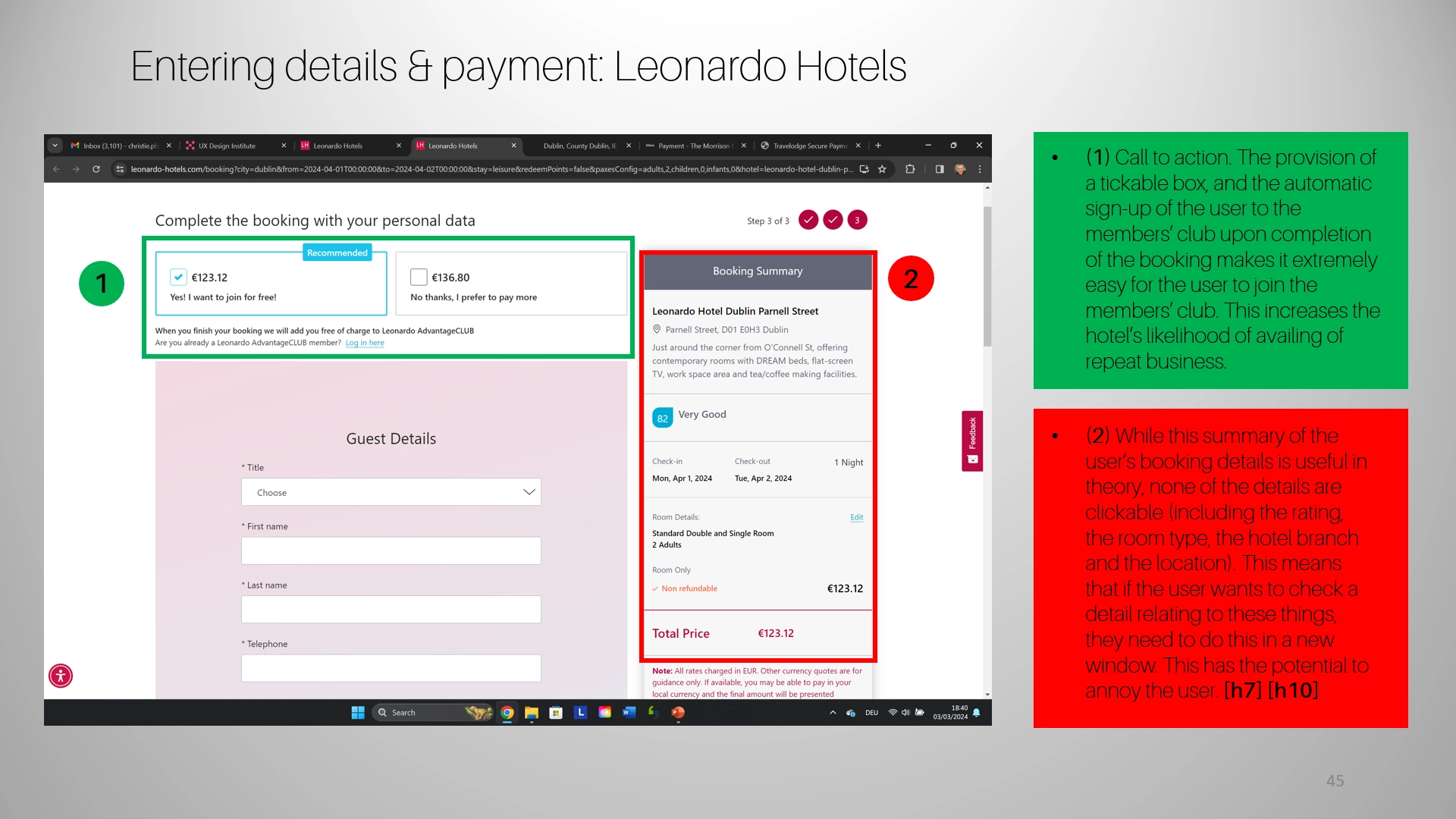
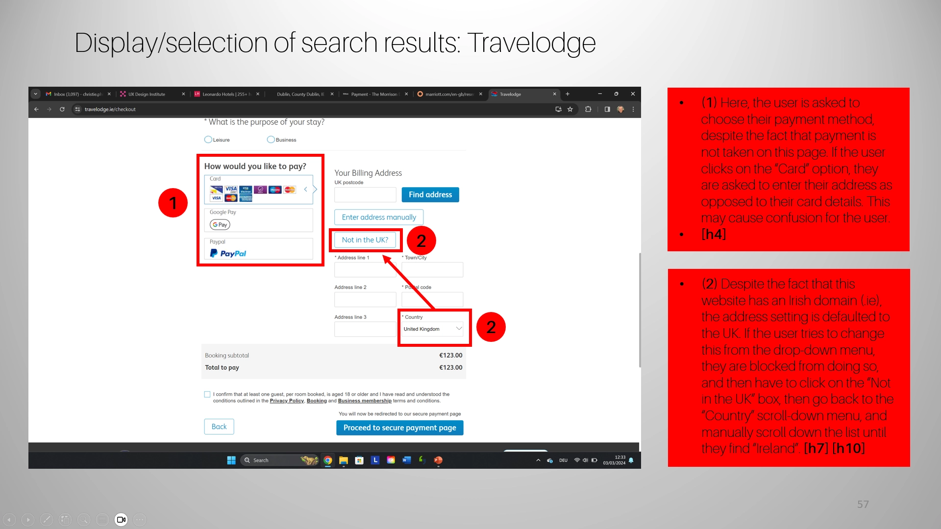
Pricing transparency
The price breakdown provides valuable cost clarity, but it should be more prominently displayed to ensure users can quickly understand their total expense.
Hotel location on interactive map
An interactive map embedded in the website should provide clarity for customers and facilitate travel planning, as well as allowing potential clients to see nearby tourist sites, public transport links, bars, restaurants etc.
- User survey
To gain deeper insights into user behaviors, goals, and experiences, I conducted an online survey with 10 participants, gathering both qualitative and quantitative data. The survey questions were carefully designed to avoid bias and align with research best practices. Open-ended qualitative questions allowed participants to share authentic perspectives without being influenced by assumptions or leading language. This approach ensured more accurate and actionable insights, serving as a foundation for understanding user needs and informing design decisions.
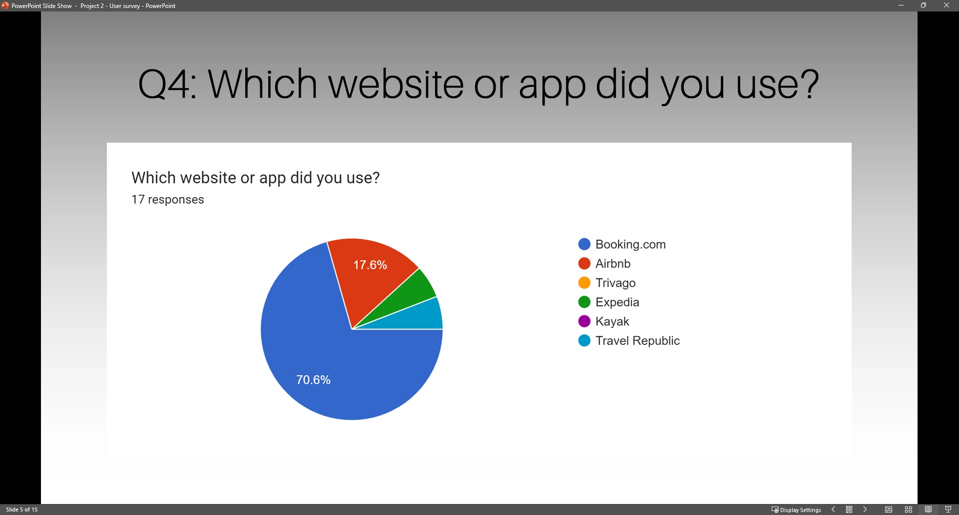
Booking platform preference
Your content goes here. Edit or remove this text inline or in the module Content settings. You can also style every aspect of this content in the module Design settings and even apply custom CSS to this text in the module Advanced settings.
Key decision factors
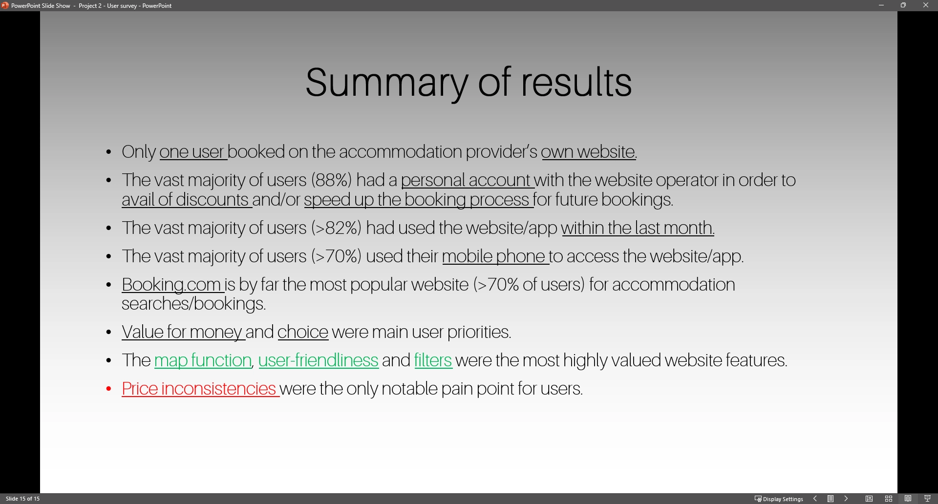
Value for money and range of accommodation options were the main decision factors mentioned by respondents.
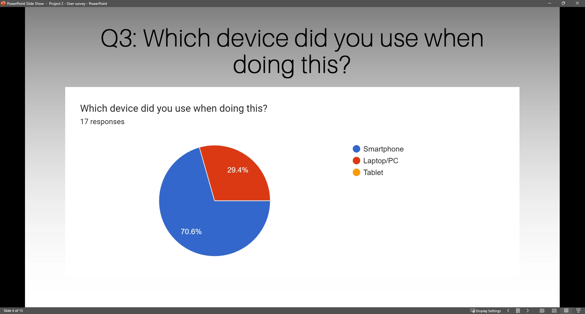
Device of choice
Mobile phones are by far and away the preferred device to access accommodation websites, with 70% of respondents logging on with their smart phones.
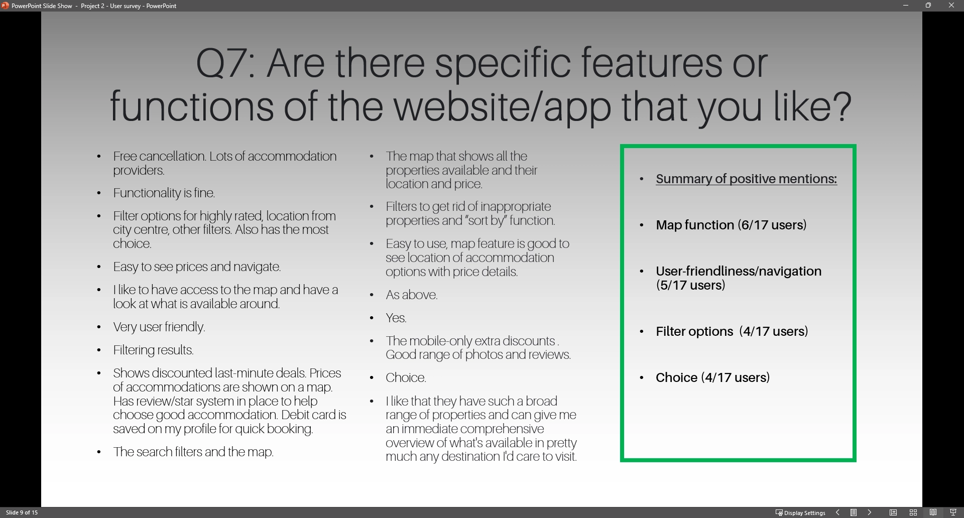
Desired features
The single most desired feature was a map function, with 6 out 17 users explicitly mentioning this. User-friendliness/easy navigation came in a close second, having been mentioned by 5 respondents.
Title
Title
Title
Title
- Usability testing
I conducted a usability test with a single participant on two hotel websites: Hilton Hotels and Leonardo Hotels.
The participant was tasked with navigating and completing booking-related tasks while sharing real-time feedback on usability and the overall experience. This test provided valuable insights into pain points and areas for improvement, as well as positive interactions that could inspire effective design solutions for my project.
1. High-quality pictures are essential for decision-making. Photos of rooms and amenities boost confidence and help users make informed choices.
2. Clearly naming and differentiating room options is crucial. Users need concise descriptions to compare and select the best fit.
3. Filters, especially by price, are vital for simplifying searches. Users value intuitive tools to narrow down their options.
4. User reviews play a key role in building trust. Accessible feedback validates choices and provides social proof.
5. A functional map feature helps users understand the location. Interactive maps with nearby attractions enhance the experience.
6. Transparent pricing avoids confusion. Clear cost breakdowns foster trust and improve user satisfaction.
STEP 2: The analysis phase
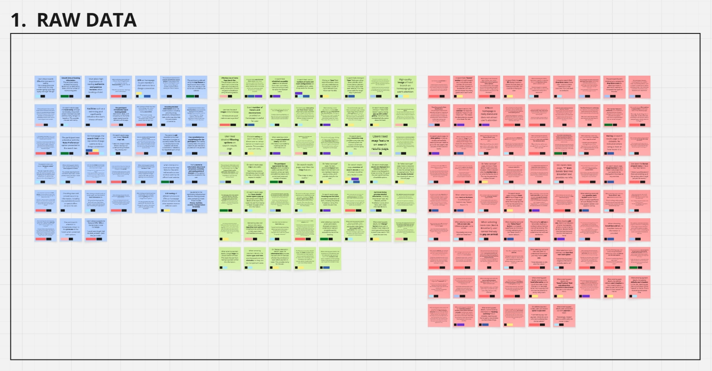
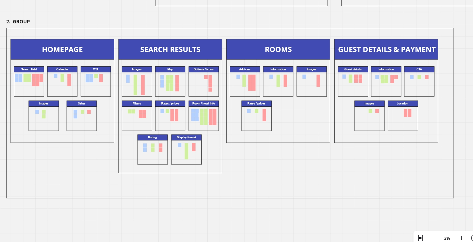
- Affinity diagram
To analyze the data, I used the affinity diagram method to organize and synthesize findings from competitive benchmarking, online surveys, and the usability test. The data was grouped into broader themes such as homepage, search results, rooms, and payment and details.
This method helped uncover patterns in user behavior and highlight areas for improvement, ensuring the insights were actionable and informed the design process effectively.
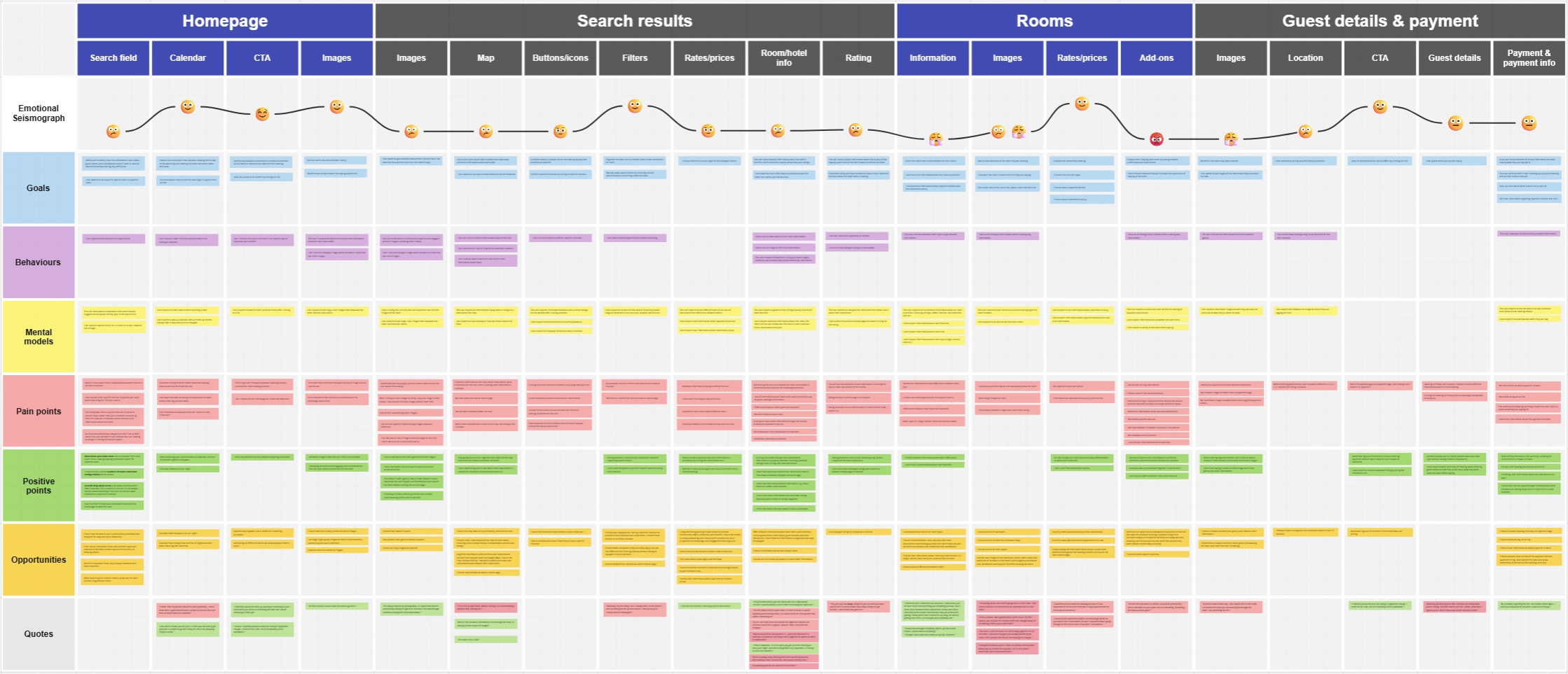
- Customer journey map
Title
To translate research insights into a comprehensive view of the user experience, I developed a customer journey map that visually represents users’ emotional journeys while interacting with hotel booking websites.
The map was divided into detailed steps, capturing user goals, behaviors, and emotions at each stage, from visiting the homepage to completing payment.
By analyzing positives, negatives, and mental models for each step, I identified key pain points and opportunities for improvement. One notable observation was a decline in user satisfaction during the room selection stage, where unclear information and low-quality pictures created insecurity about the booking process.
Adding user quotes to the map provided further depth and ensured the user’s voice remained central to the analysis.
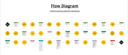
- Flow diagram
To analyze the data, I used the affinity diagram method to organize and synthesize findings from competitive benchmarking, online surveys, and the usability test.
The data was grouped into broader themes such as homepage, search results, rooms, and payment and details. Within these themes, smaller clusters like search fields, images, information detail, and rates/prices were identified.
This method helped uncover patterns in user behavior and highlight areas for improvement, ensuring the insights were actionable and informed the design process effectively.
STEP 3: The design phase
- Prototyping
After sketching out a rough draft of the homepage I wanted, I first developed a wireframe.
This then became a high-fidelity prototype for desktop to provide a realistic feel for the booking process and ensure a seamless user experience. This prototype went through several iterations, incorporating feedback to refine the design and address pain points identified during user testing.
The focus was on creating an intuitive flow for tasks like searching for rooms, comparing options, and completing bookings while maintaining clarity and usability.
I designed several specific modules based such as tabbed pop-ups with slider galleries which provide users with in-depth hotel and room information. Images of these can be seen below.
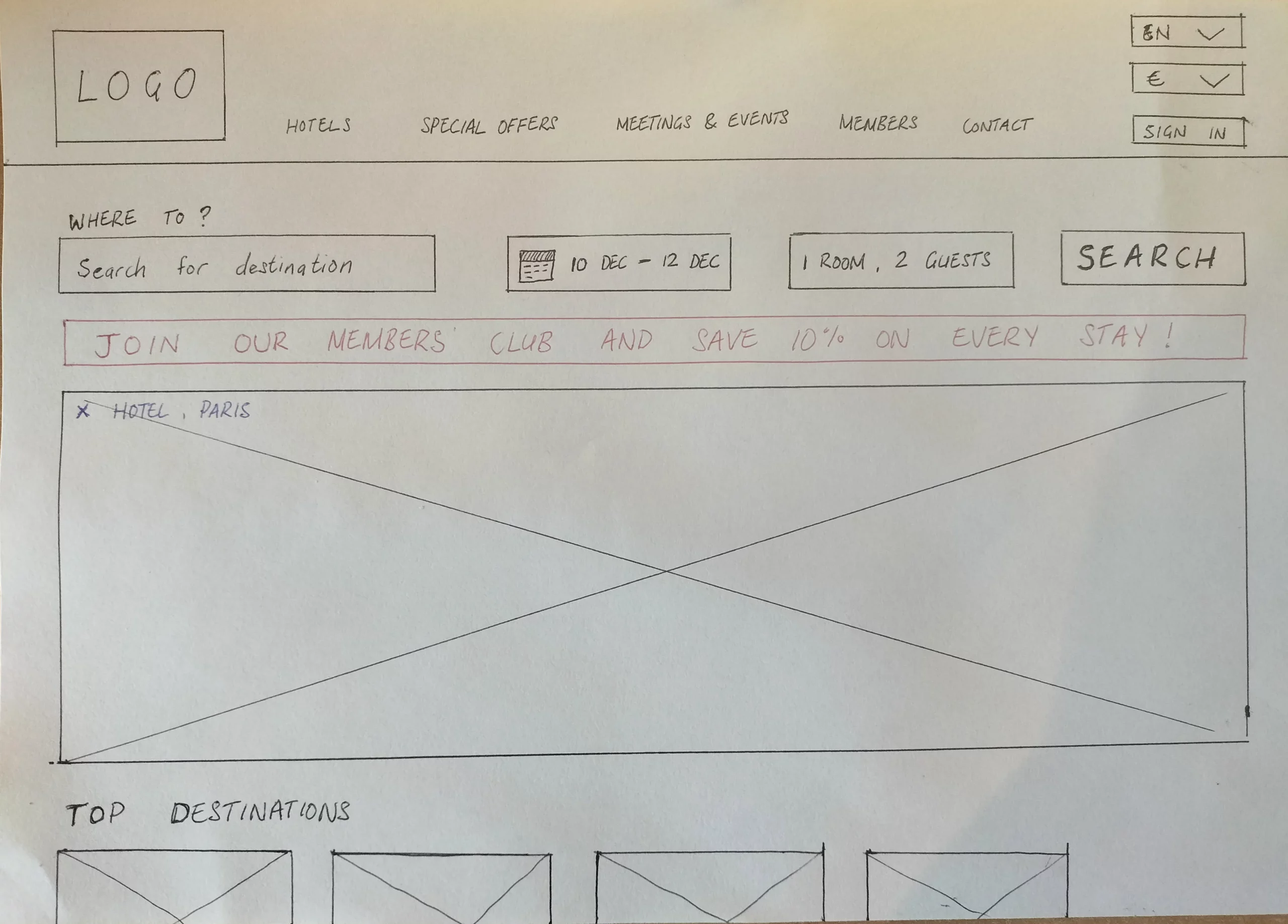
Before:
The rough sketch was based on two things:
1) The user’s mental model of an accommodation booking site. I felt it was important not to do anything too revolutionary here, as users can become frustrated and confused very quickly if websites and apps do not conform to their mental model.
2) A collation of all of the user research which was carried out at the beginning of the UX process. This allowed me to ascertain what was important for the user and to prioritise this.
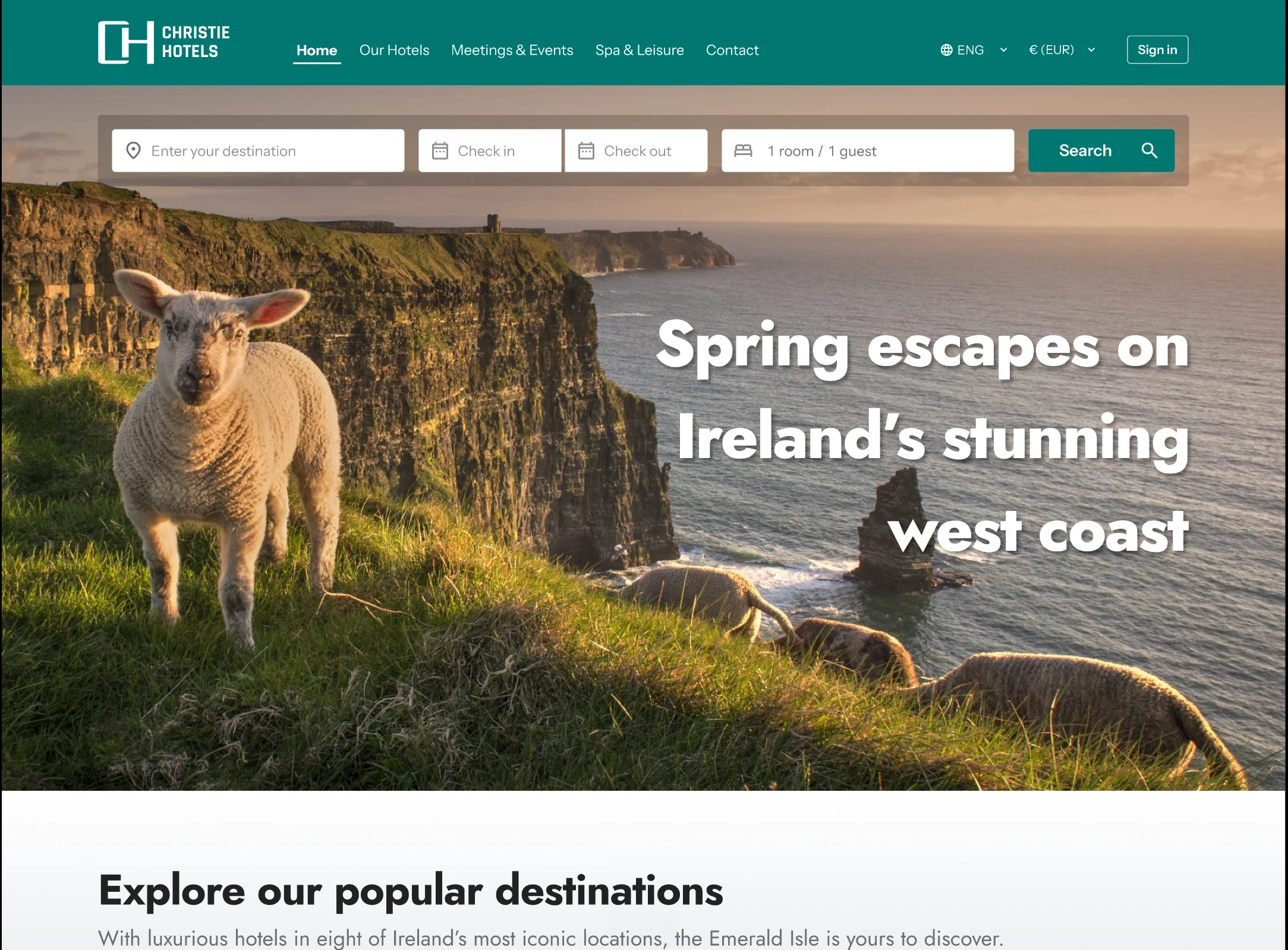
After:
After completing a UI design course, I created a design system that allowed me to establish consistent patterns, typography, and color schemes. This helped me craft a cleaner, more cohesive interface, improving both the aesthetic appeal and usability. The design system ensured a smoother user experience by creating intuitive, repeatable elements that enhanced the overall flow and interaction.
Pop-up modules
This design necessitated the development of a number of pop-up modules which I felt would greatly improve the user experience.
In the testing phase, I noted that a number of uers had expressed frustration with the lack of in-depth information around hotel and room facilities, as well as a lack of images of the room in particular, and the hotel in general.
Pop-ups are the ideal choice for these modules as they allow the user to quickly view the desired information without having to leave the page that they are on.
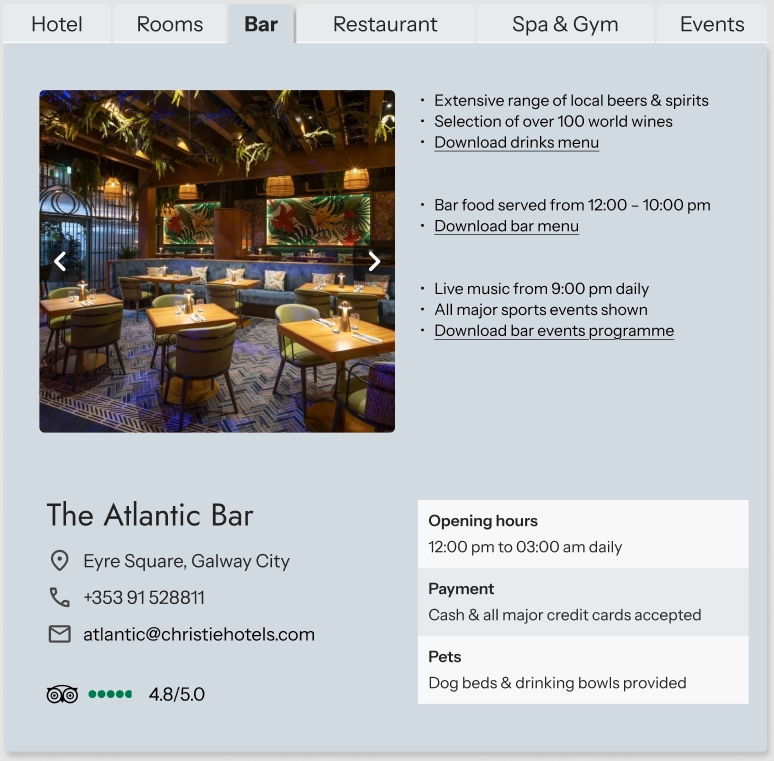
Hotel info pop-up
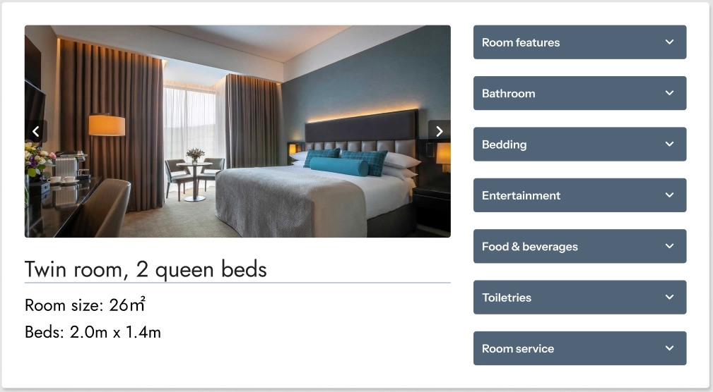
Room info pop-up

Members' Club pop-up
The prototype
Want to explore the user journey?
Feel free to interact with the Figma prototype below. To expand to full screen, click on the arrow icon in the top right corner.